There is no point denying it; Outlook 2013 is white, VERY white and for some, this can lead to problems.
Even though white is the base color for all Office 2013 applications, interestingly enough, most complaints are targeted towards Outlook. This could be because the other applications are more like sheets of paper and white feels more natural then. In Outlook, there is a whole lot more interface as well where too little contrast can be more confusing.
I’m no expert in that field though, but luckily Outlook is more my playing field. Let’s look at the options available to make Outlook 2013 less white and bright or otherwise give it a more “classic” look!
- Themes: White, light gray and dark gray
- Add some Ribbon decoration
- Put back the Navigation Strip in the Folder Pane
- Blue bar, blue subjects and no more read/unread envelopes
- Large sender names
- Message previews
- Gridlines
- Small Folder Pane font
- Re-enable the To-Do Bar
- Final thoughts
Themes: White, light gray and dark gray
If lack of contrast is your main issue, changing the theme might help already. However, the alternatives are “light gray” and “dark gray” so things are not getting more colorful.
When you are logged into Office with a Microsoft Account, you can change your theme via:
File-> Office Account
As an alternative, or when not logged on with a Microsoft Account, you can also use:
File-> Options-> General
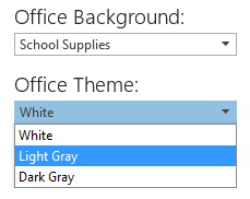
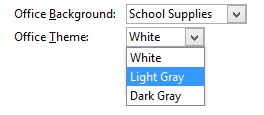
After so many years of having a blue interface by default in Windows and/or Office, these alternatives can be somewhat depressing, dull or at least disappointing.
The light gray theme takes out a lot of the pure whiteness while the dark gray theme often is the theme of choice for (graphic) designers. The latter also affects the program’s color (like the File tab and the Status Bar) a lot more.
Personal note:
The BETA versions of Outlook 2013 were even worse color and white/contrast wise and this is also where a lot of negative feedback on the white theme is coming from originally. The white theme in the released version is actually much more workable. Upon release, I chose the light gray theme to get over my white allergy. About 2 weeks later, I tried the white again and it is now my default theme.
Add some Ribbon decoration
When you are logged on with your Microsoft Account to Office 2013, via the link in the top right corner, you have the additional option to decorate your Ribbon with various background images.
There are 14 backgrounds to choose from. While none of them contain any color, they do break the whiteness or monotonous look a bit without being a distraction.

Personal note:
I was skeptical about this addition at first (the word “pointless” came to mind) but once I’ve finally chose one and tried it for a week, I actually kind of like it. In case you were wondering; I like the School Supplies best for some “hidden” reason but also because it matches the function of Office itself and therefor feels less out of place.
Put back the Navigation Strip in the Folder Pane
While this change actually introduces more whiteness, it is a reasonably big visual change which might give a strange feeling to the redesigned interface of Outlook as well; the Navigation Strip at the bottom.
If you prefer to have in back in the Folder Pane (which used to be called the Navigation Pane), you can do so via: tab View-> button Folder Pane-> Options…-> select: Compact Navigation
The only thing you can’t, which was possible in previous versions of Outlook, is pulling it back up so that the modules are listed top to bottom.


Personal note:
I still have the Navigation Strip at the bottom, even on my 768 pixel high netbook. I have it configured to show: Mail, Calendar, Contact, Tasks and Notes. I actually don’t use them very often though as I usually use the keyboard shortcuts CTRL+1, CTRL+2, CTRL+3, etc…
Blue bar, blue subjects and no more read/unread envelopes
Instead of using envelopes to more visually display the message’s read or unread status, Outlook 2013 now uses a blue bar. If there is a blue bar in front of the message, it is unread, if there isn’t, it is unread.
Tip!
When you hover over a message which is marked as read, you’ll see a faint line where the blue bar used to be. When you hover over this line, it becomes wider. Click on this to mark the message as unread again. You can do the same for messages which are marked as unread to mark them as read.
If you don’t like all this blue, you can change it back to black (or 15 other colors) in the following way.
- Tab View-> button View Settings-> button Conditional Formatting-> select: Unread messages-> button Font…
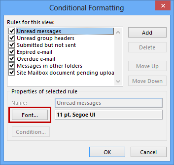
Personal note:
I’ve experimented with having it set to black for week in the white theme but then I switched it back to the default color. Setting it to black might look better for the “dark gray” theme though.
Large sender names
This might have gone unnoticed for the most of you but the name of the sender of the message is now displayed in a larger font than the subject. However, this might give the feeling that something is a little “off” anyway. If you are looking for more consistency, you can decrease the font size by adding a Conditional Formatting rule;
Tab View-> button View Settings-> button Conditional Formatting-> button Add…
- Name: Smaller
- Font: Smaller
- Condition: No need to set any
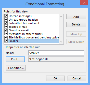
Personal note:
The gaps between items were much larger in the BETA versions which made me come up with this workaround. I’m now happy with the default of having the sender’s name being displayed more prominently.
Message previews
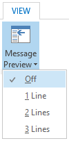 By default, the message list now shows item previews as well. This could make the overview less clear as it was. If you’d like to have it disabled again, you can do so via tab View-> button Message Preview. You have the option to show 1, 2 or 3 lines or to turn it off.
Unlike previous versions of Outlook, there is no longer the option to only show the Message Preview for unread items.
Personal note:
I’ve never been much a fan of the item preview and always had it turned off (which was the default anyway) even for unread items. I still don’t like them now and have the feature turned off as it just takes up too much space. I have the Reading Pane on the right so a 1 line preview usually only shows a greeting and 3 or 4 additional words anyway.
Gridlines
The gridlines between the messages make the separation between messages more clear. In addition to switching it on or off, you also the option to set the separator to small dots, large dots and dashes.
Tab View-> View Settings-> button: Other Settings

Personal note:
I like having a clear separation between the messages and have set it to solid which luckily has become the standard in the released version of Outlook 2013 as well. When I was experimenting with the Message Preview option and had it set to 2 or 3 lines, I actually preferred having the gridlines off as the separation between messages was already clear enough to me and it cleaned up the interface.
Small Folder Pane font
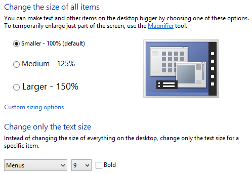
In Outlook 2010, you could set the font size for your Folder List Pane. In Outlook 2013, this is now no longer possible within Outlook. If the font is too small for you, your only option in Windows 7 is to increase the dpi size settings for Windows itself.
Right click on your Desktop-> Screen resolution-> Make text and other items larger or smaller
In Windows 8, this section has the additional option of only increasing the font for specific sections in Windows. For the Folder Pane font, this matches with the “Menus” font in Windows.
Personal note:
I’ve been lucky enough not to have any readability issues with the default font size. However, on my Surface Pro, it was needed to increase the dpi size (it actually came preconfigured with the dpi settings set to 150%). Changing the dpi settings in Windows would always be my first choice if font and item sizes in general is an issue. The “fine tuning “options available in Windows 8 is a welcome edition if only a specific font size is troublesome.
Re-enable the To-Do Bar
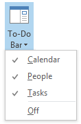 A big visual change is that by default, the To-Do Bar has now been disabled in Outlook 2013. This of course freed up a whole lot of space. Even with the To-Do Bar off, it’s functionality is not lost but still available when hovering above the words Calendar, Contacts or Tasks in the Navigation Strip. These “Peeks” work in the same way as their “pinned” or “docked” counterparts.
If you prefer to have the To-Do Bar back again, you can do this via:
View-> To-Do Bar
Personal note:
I’ve re-enabled the To-Do Bar again for the Mail Navigation in the following order: Calendar, Contacts, Tasks
Re-enable the Folder List
Depending on your monitor size, screen resolution and dpi settings, the Folder List might be minimized for you. If so, you can enable it again via tab View-> button Folder Pane-> Normal
Personal note:
Upon a clean install of Office 2013 on my Surface Pro tablet, the Folder Pane was hidden for me. As I monitor multiple folders and I don’t like reading sideways, re-enabling it was one of the very first changes which I made. I don’t find it a waste of space or would otherwise use the Reading Layout.
Final thoughts
 One of the goals of the new Outlook 2013 interface was to make it look more clean while keeping the most commonly used features still in-sight or closely available. In general, this goal has been achieved although you probably end up “unhiding” some of the features and do some other customizations. This is OK; that is why the options are there in the first place.
On the other hand, they might have gone a bit overboard for Outlook. Compared to the other main Office applications, Outlook contains a whole lot more “program interface” in relation to content. The lack of contrast in the default white theme can make Outlook 2013 a bit hard to work with, especially in the beginning.
Even though at least one of the provided themes is workable for most people (albeit with some adjustment time), the lack of some true themes to choose from remains a bit disappointing.
Ever since Outlook 2007 (when Office themes were introduced), I wondered why there was no theme which simply followed your Windows default color setting. Outlook 2003 did this for the even more complex Windows XP skins. Back then, this worked because Office 2003 followed the Windows XP design guidelines.
I truly wonder why the Office team decided not to follow these anymore, not even color wise. Otherwise, what is the whole point of being able to choose a “mood color” in Windows if none of the applications follow it, not even Microsoft’s own? What happened to these design guidelines for Windows?
If the chosen Windows colors for the user doesn’t work out in Office, he/she can always revert back to one of the default “optimized for Office” skins instead.
My ramblings aside; With the push of releasing Office 2013 mainly as a service in the form of Office 365 for Home and Office 365 for Business, Microsoft is also promising more frequent refreshes (once every quarter of a year) with new or ”revamped” features rather than just supplying fixes and leaving new features for new versions.
Unfortunately, that did not apply to the current Office skins but a new “Colorful” theme has become the new default skin in Office 2016. While this theme isn’t coming to Office 2013, everybody who uses Office 2013 as part of an Office 365 subscription can upgrade to Outlook 2016 “for free” as upgrades are included in the Office 365 subscription service.
To see what else Outlook 2016 has to offer over Outlook 2013 see: New and Changed in Outlook 2016.

The new Colorful theme for Outlook with the School Supplies background. (click on image to enlarge)


